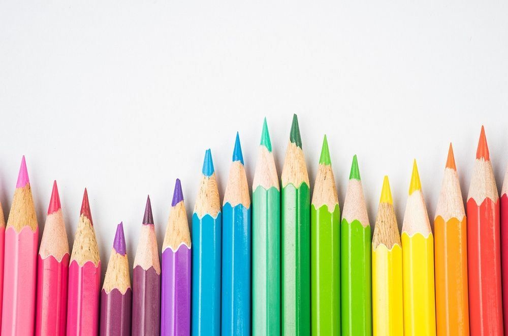
When brands are looking at crafting broad marketing campaigns, a lot of effort, research and resources are poured into things like ad text and calls to action. However, there's one facet that's so obvious many marketers miss it completely: color.
Ogilvydo posits that because color evokes instantaneous emotions, reactions and physical responses, it can have a profound influence on the choices consumers make (even unconsciously), which is why this seemingly insignificant element of display ads can have an outsize impact on conversions and, ultimately, your bottom line. Here's why brand colors are so important.
1. The First Impression Is the Most Important
An infographic compiled by Colourfast and reported by Entrepreneur states that 93 percent of purchasing judgments are made based on visual perceptions. And what's the first thing consumers notice when they look at an image? Color. This is why the strategic use of brand colors is important.
For instance, the color red is often associated with feelings of power, excitement and energy, which is why you'll find brands such as Coca-Cola, Red Bull and Netflix using bright red not only in their logos, but in their advertising as well.
Meanwhile, brands that use the color blue are often associated with feelings of trust and security, which is why brands such as Facebook, Visa and Ford use this color extensively. Being mindful of what feelings a specific color can engender can help boost your first impressions and immediately set a specific tone for your brand.
2. Contrasting Colors Can Boost Recall
The white and blue of the Facebook logo or the purple and orange of FedEx, for instance, both feature very bold, contrasting colors and are instantly recognizable (and easy to recall) as a result. Making sure your brand colors contrast and stand out against whatever's nearby will help your ads stay in consumers' minds long after they've clicked away.
3. Color Can Help You Connect With Specific Audience Segments
Entrepreneur also cites research pointing out that color perception and preferences can actually vary by gender. Generally, men seem to prefer bold, non-transparent, solid colors while women often prefer softer tones that are less opaque and mixed with white. So if, for instance, you're marketing products at a coffee shop, you might promote a new coffee drink to men with a bold color palette to convey excitement about the drink. And on the flip side, if you're trying to market the coffee shop's newest breakfast sandwiches to women, softer tones that evoke the feeling of gentle morning wakefulness might be more effective.
Though there are many factors that go into a particular ad's effectiveness, marketers simply cannot afford to ignore color, as choosing the right hues for your ads can affect first impressions, recall and even the demographics those ads reach.